Affiliate websites are designed by drag and dropping widgets onto a page that allow for a wide range of different types of content to be displayed. DecoNetwork’s software features over 30 website design widgets that can easily be added and then configured to display perfectly on a website and any type of device: desktop, tablet, smartphone. The widgets are broken up into 6 sections, which are: Basics, Lists, Media, Business, Social, & Advanced.
The Basics section includes many of the most commonly used widgets, which include adding text, buttons, spacing, dividers, and columns. Columns/Rows should be used to create the foundation layout for other widgets. Columns/Rows allow content (widgets) to display optimally on any type of device.
Text Used to Display a Paragraph(s) of text.
Form A contact/messaging tool used to collect information from a customer.
Spacer Used to add blank space between widgets to create natural spacing separations
Divider A line that is displayed horizontally across the page to help separate content
Heading Used to display 1-2 lines of text, Typically to draw the customer’s attention
Page Title The same as a heading, but meant to display the page title (automatically)
Button An easy to identify link that often changes color when hovered over
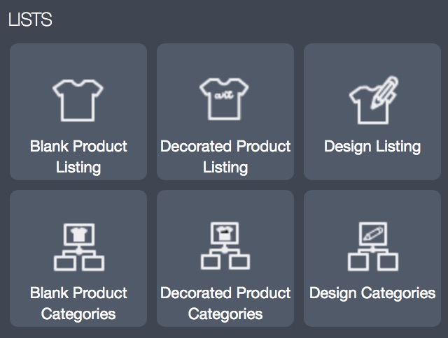
The Lists section is where Designs, Black, & Decorated Products Listings and Category widgets can be dragged and dropped onto the website. The Listing version of the widgets are used to display designs, blank products available for decoration, or pre-decorated retail products for sale. The Category version of the widgets are used to display the categories that the listed designs or products correlate with. The category widgets allow for designs and products to be navigated easier by visitors on the website.
Blank Product Listings Used to display individual blank (customizable) products
Blank Product Categories Used to display categories of blank (customizable) products
Decorated Product Listings Used to display individual decorated (retail) products
Decorated Product Categories Used to display categories of decorated (retail) products
Design Categories Used to display individual designs
Design Listings Used to display categories of designs
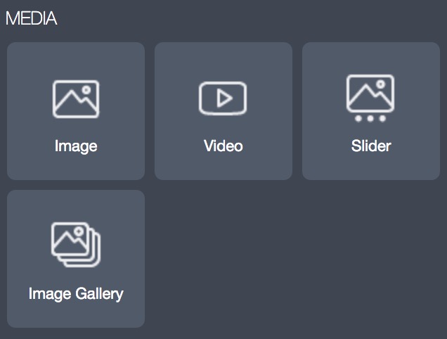
The Media section is where Image, Video, & Slider widgets can be dragged onto the page to display unique content not related to text or products. The Image and Video widgets are very simple to use, while the slider widget is one of the more advanced.
Image Used to display an image
Video Used to display a video
Slider Used to display content on multiple slides, Typically for CTA
Image Gallery Used to display several images through some type of collage
The Business, Social, & Advanced widgets are not used as often as the Basics, Lists, & Media. These widgets are typically used in the footer, header, and about/contact page(s) of a website.
Business: Logos, Login, Map, Newsletter Signup, Shopping Cart
Social: Twitter Feed, Instagram Gallery, Social Network Links
Advanced: HTML, List of Links, Store Directory
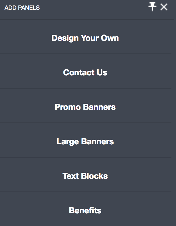
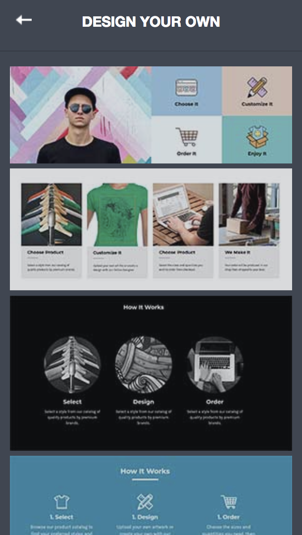
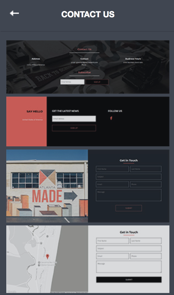
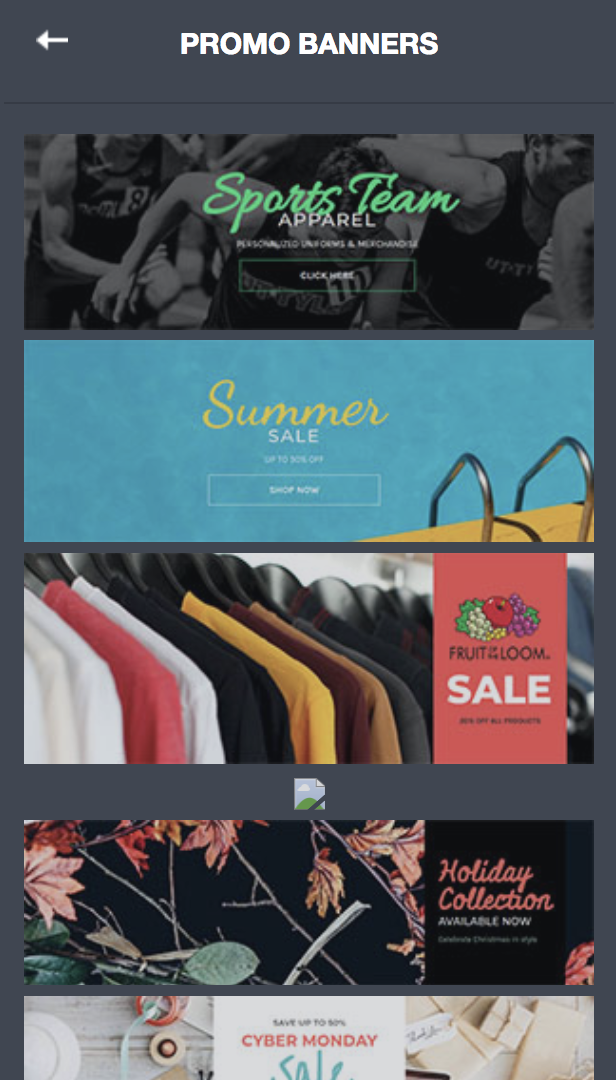
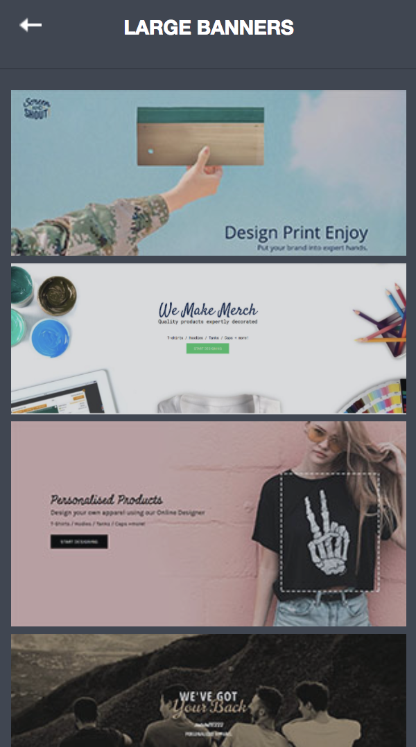
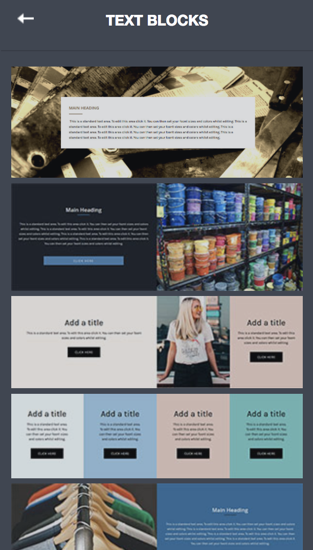
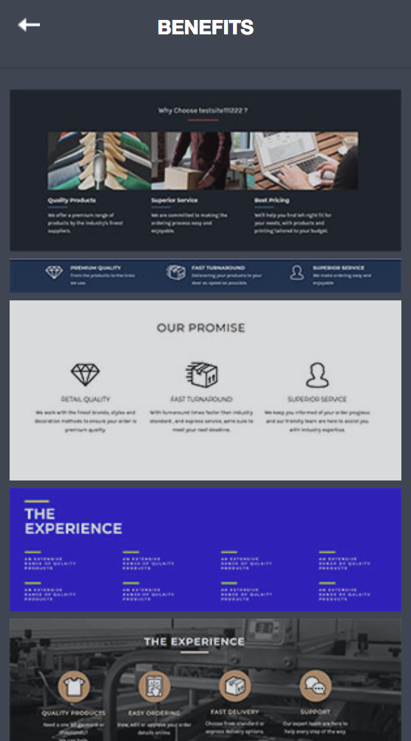
“Panels” are essentially pre-formatted widgets that typically contain text, buttons, headers, and other content. Panels can make designing a row of content easier because they contain multiple widgets that have been configured to display optimally on a page. Panels are broken up into 6 sections, which are: Design Your Own, Contact Us, Promo Banners, Large Banners, Text Blocks, & Benefits.
Once a Panel has been added to a page it is very easy to swap out the variable content and be done compared to designing something similar from complete scratch.