Designing an affiliate website can often feel overwhelming if you have never used DecoNetwork’s content management software (CMS). By breaking down the website design process into simple steps the software starts to become less intimidating/complex.
An Introduction to DecoNetwork’s Website Design Widgets
Deconetwork has over 30 website design widgets that are easy to use and are always being improved upon by the DecoNetwork team. Each widget was designed to display some type of content on a page of your website. It is as easy as selecting the widget (type of content) you want to add, and then dragging and dropping it onto the page. Once the widget has been placed on a page, its settings must be configured so that the content is ideally displayed on the site. If you plan on using the same widget multiple times with the same general settings, just different content, then you will want to take advantage of the ability to “clone” a widget. By cloning a widget your content take less time to configure, and it's also more consistent across your site. A great trick for copying a widget from one page to another (without copying the entire page) is to drag a widget into the footer of your website, save the page, and then go to the other page you want to add the widget, which can easily be dragged from the footer into the body of the page.
The Importance of Using Columns & Rows to Organize Content
While there are over 30 design widgets to choose from, it all starts with understanding how Columns and Rows work. Content on an affiliate website is organized into rows, and within each row are 1-6 columns that are used to help organize the display of the other design widgets. So, it is important that each widget be placed into a column and not directly onto the page of your website. Depending on the page/website, there might be 4 rows of content with each row containing 1-6 columns (dividers). An individual column can also have a row of columns placed within it to create even more ability to separate widgets (content) on a page. Columns and rows are very important when it comes to how a website acts on mobile devices. Since rows contain columns of content, and mobile devices displays less content than a desktop, the columns typically end up stacking up onto one another from left to right. The page will often look longer on a mobile device, but by using rows and columns the content will display great on any device.
A Snapshot of What Content the Basic, List, & Media Widgets Display
DecoNetwork’s 30+ design widgets are broken into 6 categories: Basics, Lists, Media, Business, Social, and Advanced. The vast majority of the time you will use some type of Basic, List, or Media widget to display content a page of your website.
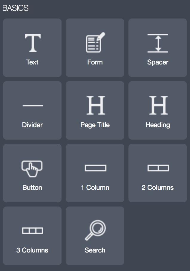
Basics
Text Used to Display a Paragraph(s) of text.
Form A contact/messaging tool used to collect information from a customer.
Spacer Used to add blank space between widgets to create natural spacing
Divider A line that is displayed horizontally across the page to separate content
Heading Used to display 1-2 lines of text, Typically to draw the customer’s attention
Page Title The same as a heading, but meant to display the page title (automatically)
Button An easy to identify link that often changes color when hovered over
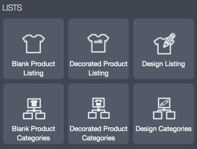
Lists
Blank Product Listings Used to display individual blank (customizable) products
Blank Product Categories Used to display categories of blank (customizable) products
Decorated Product ListingsUsed to display individual decorated (retail) products
Decorated Product Categ. Used to display categories of decorated (retail) products
Design Categories Used to display individual designs
Design Listings Used to display categories of designs
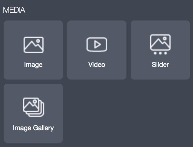
Media
Image Used to display an image
Video Used to display a video
Slider Used to display content on multiple slides, Typically for CTA
Image Gallery Used to display several images through some type of collage
An Introduction to DecoNetwork’s Website Design Panels
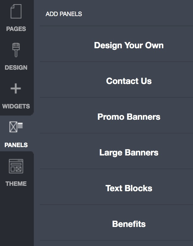
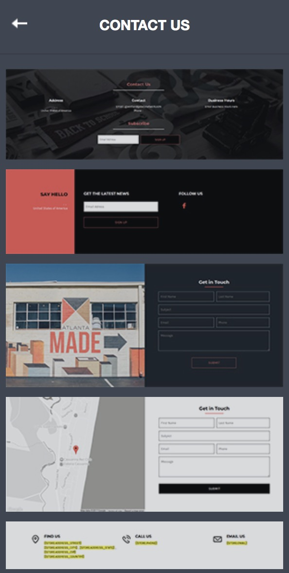
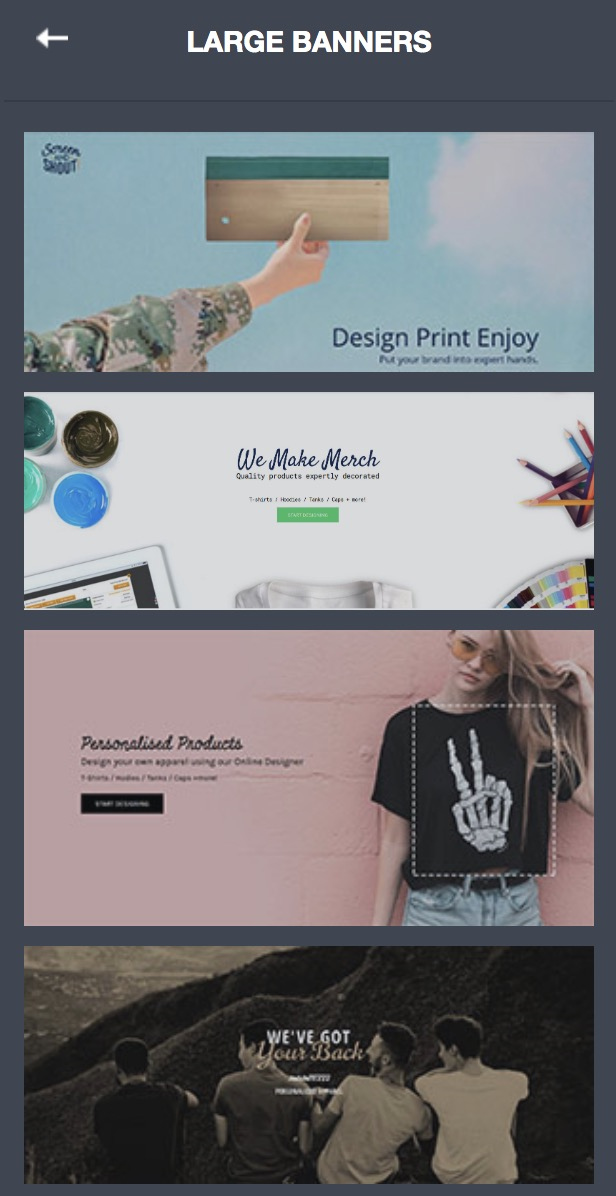
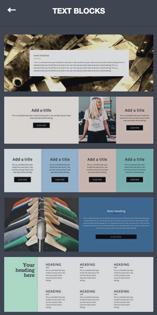
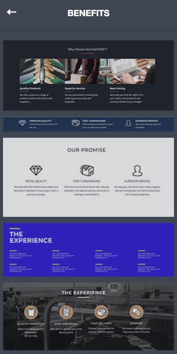
To make designing an affiliate website easier, DecoNetwork has created pre-formatted columns and rows (panels) that contain multiple widgets to create some type of banner that can easily be edited instead of creating something similar from complete scratch. The different type of design panels are separated into Design Your Own, Contact Us, Promotional Banners, Large Banners, Text Blocks, and Benefits. Most panels have their content display ready and may not even need any changing. Panels can also be very helpful when it comes to spacing content whether it be 1 or 6 columns wide. Sometimes a good way to look at it is that Promotional & Large Banners are typically 1 row, Contact Us is typically 2 rows, and Design Your Own, Text Blocks, and Benefits, are typically 3-6 rows.