Content is displayed on an affiliate website by drag & dropping one of 30+ widgets onto a page. Widgets should almost always be dragged into a Column/Row and not directly onto the page. Columns/Rows are somewhat of the key to how content is displayed on different types of devices. While each widget has its own responsive settings, columns/rows allow for more control of the way content is displayed on devices.
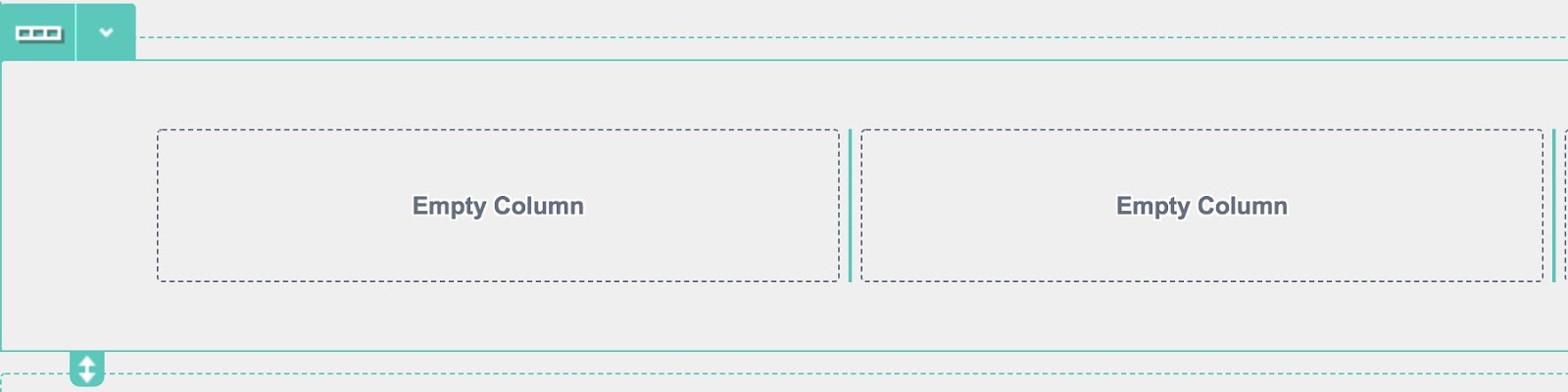
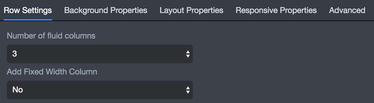
Content displayed on a page should be done so by stacking rows on top of one another with each row having the ability to be split into 1-6 columns. Columns allow for a row to break up content into sections for ultimate content display capabilities. Once a row has been added to a page the first thing that must happen is to decide how many columns it should be broken into. It is important to remember that a row contains a number of columns, but within a column another row can be added to help separate content.
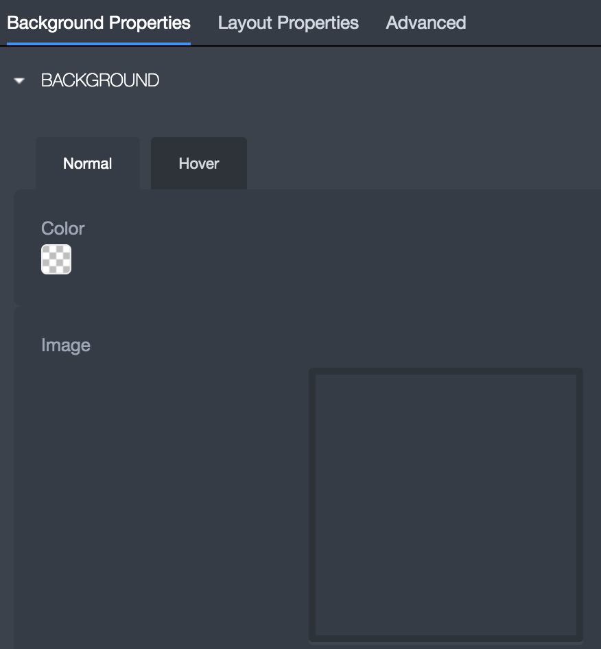
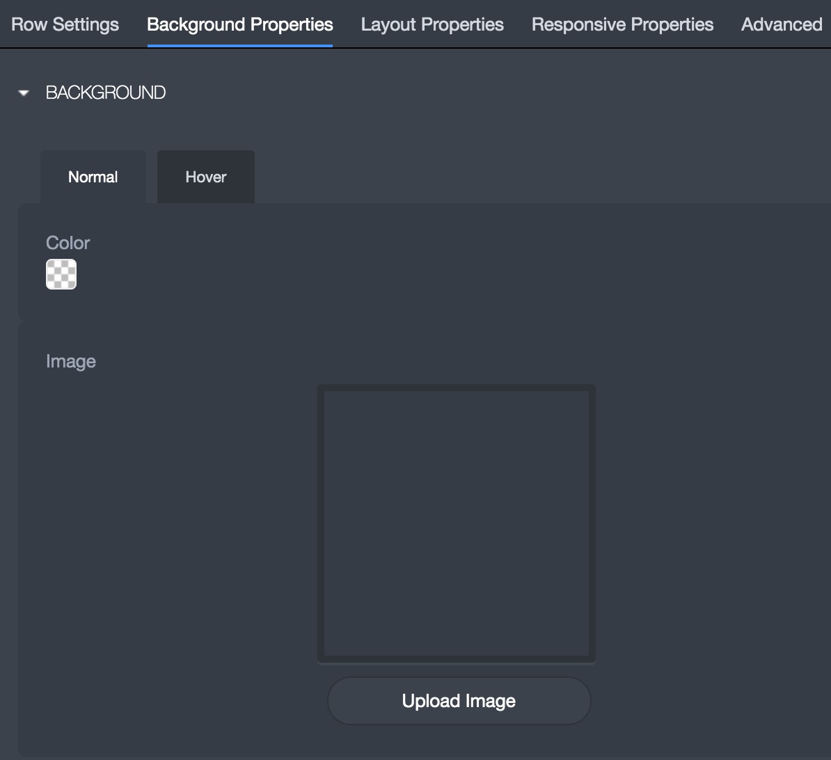
Columns have similar design settings to most widgets, with the most popular being: Background (add an image or color), alignment, margin, and padding.
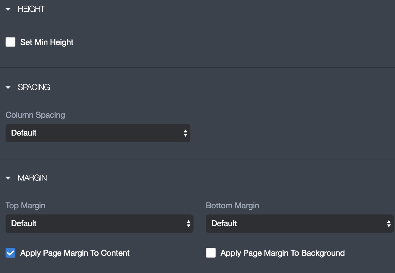
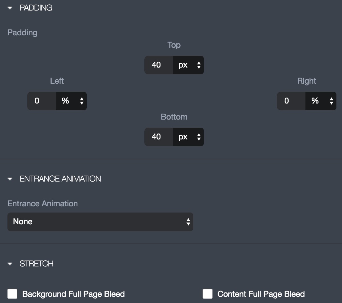
The most popular row settings revolve around: Background (add an image or color), Height, Spacing, Margin, Padding, Animation, and Stretch.
The spacing is used to adjust the amount of space in between each column. The margin is used to add spacing between the top and bottom of the entire row.
The padding is used to add spacing within the row. The entrance animation is used to animate the content within a row and stretch is used to adjust the width of the row.
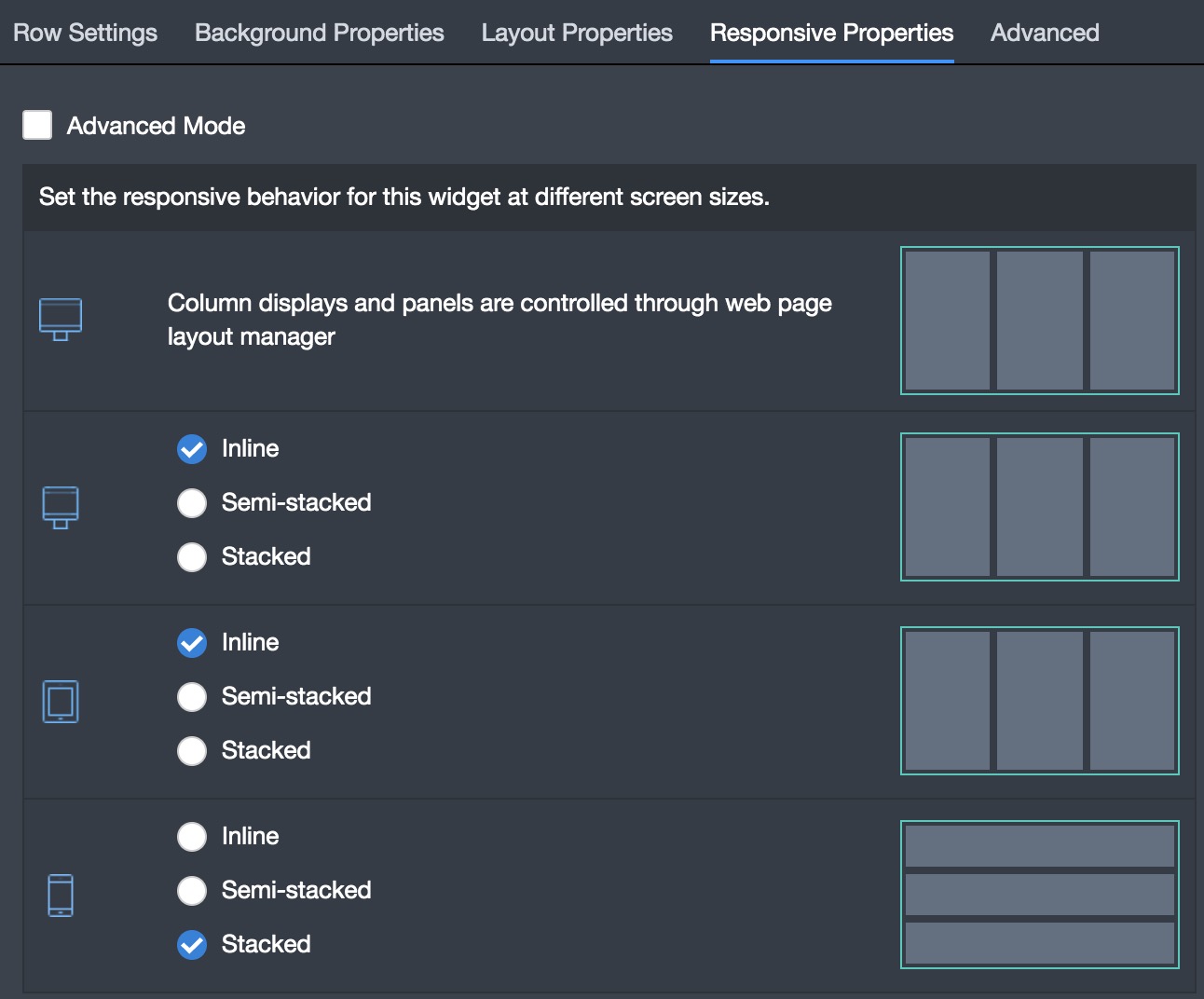
The responsive properties is where you configure how content is displayed on the different devices. These settings revolve around configuring how columns act within a row as far as being either: inline, semi-inline, or stacked.