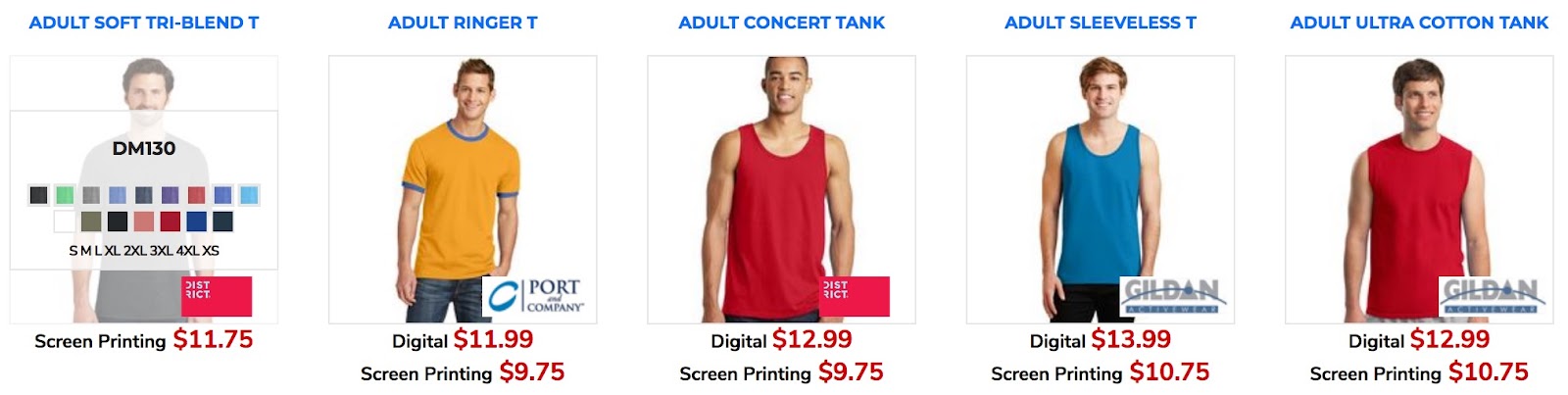
The Design Listing & Category widgets are used on just about any website that sells decorated retail products. The “Design Listing” widget is used to list all of the retail products for sale, typically for a specific category.
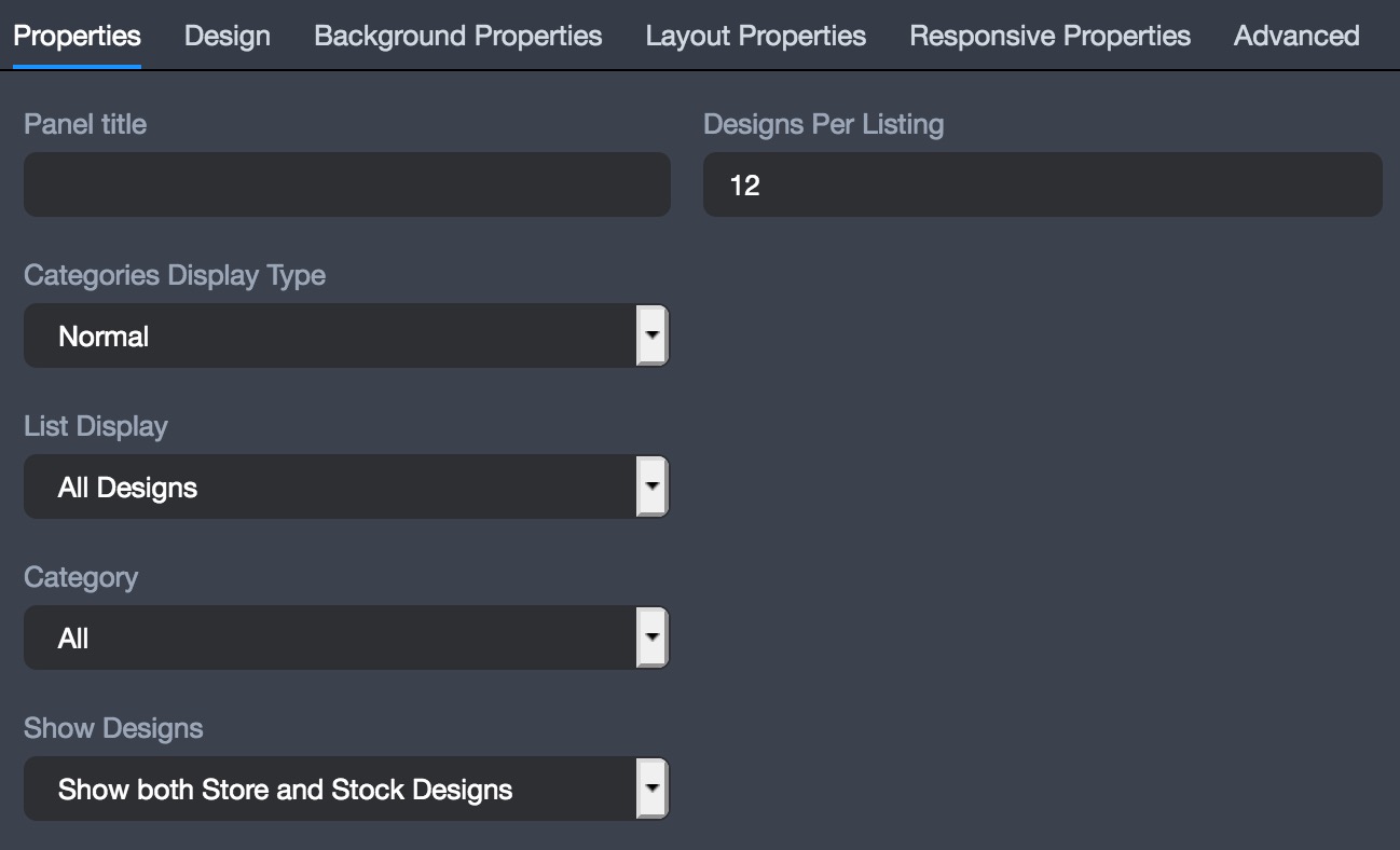
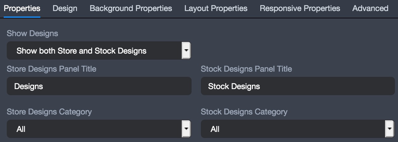
The first step in setting up a “Design Listing” widget is to configure the “Properties” section, which has several important settings, including the amount of designs displayed on a page, what prices are displayed, the category(s) of products to be shown, and how the categories are to be displayed. A cool feature within the properties panel is to make the “Categories Display as Tabs”, which allows you to choose to list several categories of products that are navigated by using tabs at the top of the widget, without ever having to leave the page.
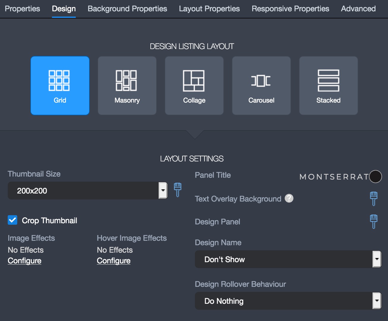
The second step in setting up the “Design Listing” widget is to configure the “Design” section, which is where the overall look of the widget is configured. The settings include configuring the “Thumbnail Size, Panel Design, Design Name, & Design Rollover Behavior”.
The “Layout Properties” is where you can configure the Design Listing’s settings as far as “alignment, margin, spacing, padding, and stretch”. The “Spacing” tool will create more space in between each product listing and the “Stretch” tool will allow the widget to have a full width bleed.
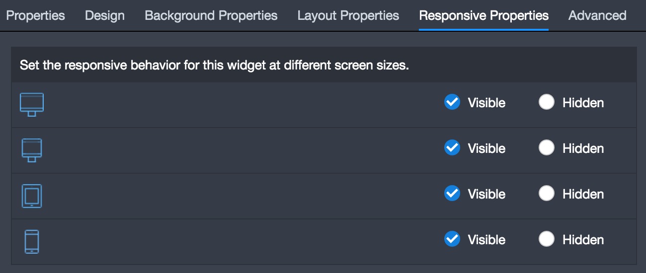
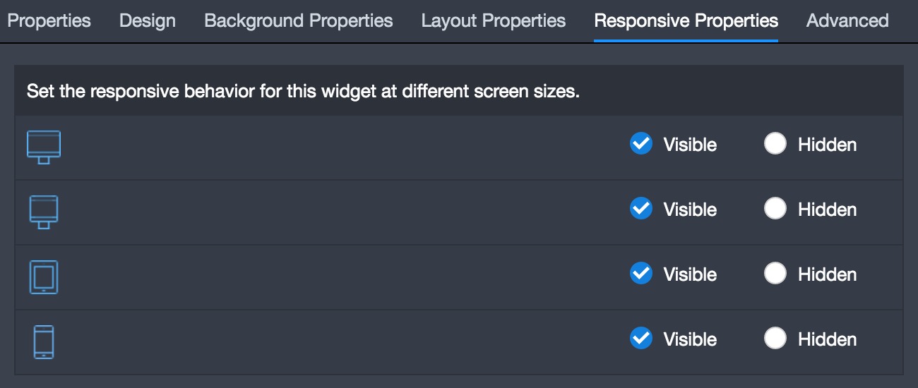
The “Responsive Properties” is where you can decide if the widget should be visible or hidden on each type of device.
The “Design Category” widget is used to display the different categories for store or stock designs. The Design Category widget is typically used to make navigating the store designs easier for the customer.
The first step is to configure the “Properties” settings by selecting the design categories that should be displayed on the page.
The “Design” section of the widget is where the overall look of the widget is configured. The settings include configuring the “Thumbnail Size, Panel Design, Design Name, & Design Rollover Behavior”.
The “Layout Properties” is where you can configure the Design Category widget’s settings as far as “alignment, margin, spacing, padding, and stretch”. The “Spacing” tool will create more space in between each product category and the “Stretch” tool will allow the widget to have a full width bleed.
The “Responsive Properties” is where you can decide if the widget should be visible or hidden on each type of device.