A slider widget allows for content to be stored/displayed as slides that rotate after a period of time. The design of the overall slider, the duration of each slide, and the slider content panels can all easily be customized. First, the amount of slides must be determined and is done within the “Slides” settings of the “Slider Settings”. To add a slide, just click on the “+” button.
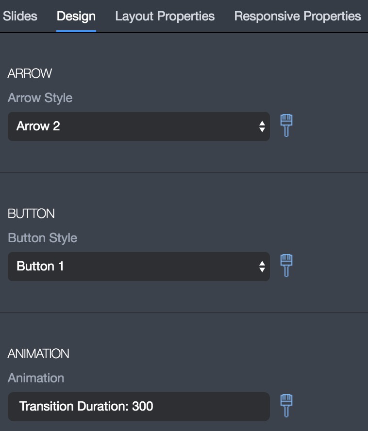
Next, the design settings for the overall slider must be configured within the “Slider Settings - Design” section. These settings include choosing the style and size of the navigation arrows and the duration for each slide.
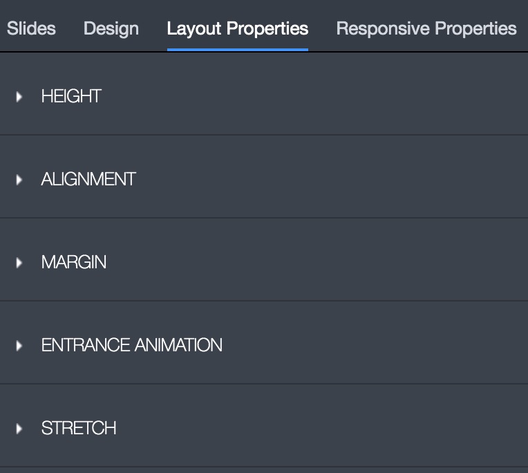
The next slider setting that should be configured is the “Layout Properties”, which revolve around the height, alignment, margin, animation, and stretch settings. The layout properties are very important to configure to ensure the slider display optimally. Alignment is typically always centered and ‘Stretch” allows for the slider to be the full width of the page.
The last slider setting that might need to be configured is the “Responsive Properties”, which controls if the slider is visible or hidden on different types of devices.
Once the “slider settings” have been configured, each slide, referred to as a “Panel,” must be configured. Each slide is designed just like any other content on a webpage by drag and dropping widgets, with each slide having its own “Panel Settings”. Each Slide acts like a “Row” widget with the ability to set the amount of “columns” so that content can be divided on a slide. Other than setting the amount of rows the “Panel settings” also include “Background, Layout, and Responsive Properties” just like the “Slider Settings”.